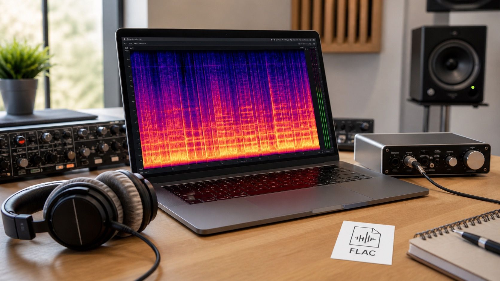
An audio to spectrogram converter is useful only when you treat the picture as evidence, not as a magic verdict. It can show clipped highs, steady hum, codec damage, strange silent gaps, or the smear left by a noisy AI music export, but the same colors can mean different things depending on the file, the settings, and what you expected to hear.
Start with a file that can tell the truth
The first decision happens before you upload anything. If you create spectrogram from audio that has already been through a phone recorder, a social platform, a screen capture, and an MP3 export, the image mostly reports that chain of damage. For a serious check, use the cleanest file you have: the original WAV, FLAC, or highest quality export from the editor. If the only version is MP3, still inspect it, but do not read the upper frequency cutoff as proof that the song was badly mastered.
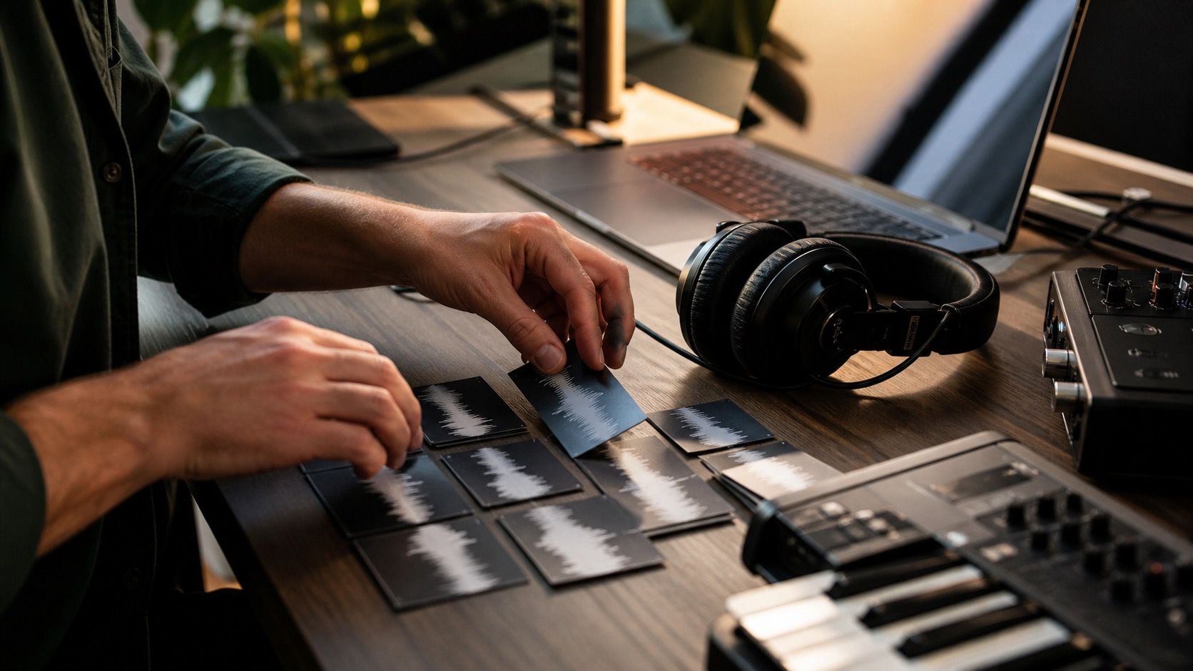
For AI music, I like to keep three files in a small test folder: the raw generated export, the repaired version, and the final mastered version. Name them clearly before using an audio to spectrogram converter online. Otherwise it is very easy to compare the wrong bounce and spend ten minutes explaining a problem that came from file handling, not from the audio.
Sample rate matters because it decides the top of the visible range. A 44.1 kHz file can only show content up to about 22.05 kHz. A 48 kHz file reaches about 24 kHz. If the converter display stops at 20 kHz, check whether the tool is hiding the top band by default. A missing band in the picture may be a display choice rather than an actual loss in the file.
Set the display before judging the colors
A spectrogram is a time and frequency map. Time runs left to right, low frequencies sit near the bottom, high frequencies sit near the top, and color usually shows energy. That sounds simple until two converters use different color scales and make the same file look either calm or disastrous. Bright red in one tool may equal yellow in another. The useful question is not whether a color looks scary, but whether it changes between versions in a way that matches what you hear.
| Setting | What it changes | Practical use |
|---|---|---|
| Frequency ceiling | How much of the high band is visible | Use it to check codec cutoffs and hiss above 16 kHz |
| Window size | Balance between time detail and pitch detail | Use smaller windows for clicks, larger windows for sustained tones |
| Color scale | How strongly quiet content is displayed | Keep it consistent when comparing before and after files |
| Channel view | Left, right, mono, or stereo display | Use it when one side has a buzz, dropout, or strange phase feel |
Window size deserves special care. A short window can make a transient click easy to locate, but it can blur pitch detail. A longer window can reveal narrow hum lines or musical harmonics, but it may smear a short glitch across time. When you generate spectrogram from audio to diagnose a specific problem, pick the setting around the symptom. A metallic tick needs time detail. A steady electrical whine needs frequency detail.
Look for cutoffs, hum, and broadband noise
The simplest pattern to spot is a frequency cutoff. MP3 and some platform encoders often remove or thin out very high content. On a spectrogram this can look like a clean horizontal ceiling where the upper band suddenly goes dark. That is not always a disaster. Many listeners will not notice a gentle cutoff above the useful musical range. It becomes more relevant when the cutoff is low, uneven, or paired with dull cymbals, papery vocals, or a lifeless master.
Hum looks different. It usually appears as one or more thin horizontal lines that continue through quiet parts. A 50 Hz or 60 Hz line, with harmonics above it, may come from recording gear, electrical noise, or a bad processing chain. In AI generated music, a similar stripe can be a model artifact, especially when it sits under a voice or pad and does not belong to any instrument. The visual check helps you decide whether to use a notch filter, re-export a stem, or go back to the generation stage.
Broadband noise is messier. It fills large areas, often like mist behind the music. In a vocal cleanup job, you may see it between phrases or above consonants. In AI music, it can sit around cymbals, distorted guitars, or synthetic choirs. The mistake is to remove every visible trace. Some air and room tone are normal. The warning sign is noise that keeps moving when the music should be still, or noise that gets louder after a repair pass.
Compare versions without fooling yourself
Comparison is where a spectrogram becomes genuinely useful. Open the raw export and the repaired export with the same converter settings. Match the loudness by ear before deciding that one picture is cleaner. A louder file often looks more saturated because the color scale responds to stronger energy. That can make a harsh master look more detailed even when it is only louder.
Check the same section in both files. A chorus, a vocal gap, and the final fade each tell different stories. The chorus reveals harsh high-frequency buildup. A vocal gap exposes hum, hiss, and leftover model noise. The fade often shows codec haze, reverb tails, or sudden gating. If you only inspect the loudest hook, you may miss the very artifact that will annoy someone on headphones.
I also avoid judging repair quality from the full song view alone. A three-minute file compressed into one picture can hide short dropouts and clicks. Zoom into the place where you heard the problem. If the converter has markers or a time readout, note the exact timestamp in your session. That makes the spectrogram a working note, not just a colorful screenshot.
Turn the picture into an actual fix decision
After you generate spectrogram from audio, decide what action the picture supports. A low codec cutoff may mean you should export from the original session as WAV or FLAC before final encoding. A narrow hum line may call for a careful notch filter. A short vertical spike may need click repair. A wide noisy band after vocal cleanup may mean the repair tool was pushed too hard.
For Suno-style and other AI music exports, the most useful fix is often restraint. If the spectrogram shows a metallic shimmer above the vocal, do not automatically cut every high frequency. Listen to the consonants, cymbals, and reverb tail. A small dynamic EQ move may keep the song alive, while a heavy denoise pass can make the whole track feel underwater. The picture should slow you down, not push you into a bigger processing chain.
Keep a short log when checking exports: file name, converter settings, symptom, timestamp, and action taken. This sounds dull, but it prevents circular work. If the repaired file looks cleaner and sounds worse, the log reminds you to trust the listening test. If the file sounds fine but shows a strange cutoff, the log helps you decide whether the delivery platform will matter. A spectrogram is best when it sits next to your ears, not above them.
Know when the converter has done enough
An audio to spectrogram converter can reveal problems, but it cannot tell you whether a song moves well, whether the vocal feels believable, or whether the master fits the release context. A clean image can still hide pumping compression, bad balance, and an emotionless vocal blend. A messy image can still be a strong track if the mess belongs to distortion, percussion, or intentional texture.
Use the visual result to answer narrow questions. Is there a hard cutoff? Is there steady hum? Did the cleanup create more high-band spray? Did the final export introduce silence at the start or end? Did one channel lose information? Those are spectrogram questions. Once they are answered, return to monitors, headphones, and a few real playback devices. The converter is a sharp tool, but it is still only one tool.